
Corpus Christi Soccer Club
Overview
Design the visual identity for a (completely fictional) soccer club.
Corpus Christi Soccer Club (CCSC), founded in 1959, has a rich history reflected in its iconic crest.
The great blue heron, a striking bird native to the region, was chosen as the club's original mascot to represent grace, determination, and the coastal environment of Corpus Christi.
The Spanish archway has always been a part of the crest, celebrating the city's historical Spanish influence and architectural heritage.
The initials CC, and later CCSC, were integrated into the design to provide a bold, modern touch to a classic emblem.
These elements together form a crest that is not just a logo, but a proud symbol of the club's roots and the community it represents.
Gulf Blue
Sky Blue
Texas Sun
White
Black
The colors of the crest tell a story all their own, and were added in the early 60’s:
Gulf blue symbolizes the Gulf of Mexico.
Sky blue represents the city's vast, clear skies.
Texas Sun was incorporated to honor the bright Texan sun and add a vibrant contrast.

1959
The original logo was simple and understated. The heron and CC lettering have been there since day 1.

1965
The first version that included color, this crest kept the original design elements with a sleeker, more mod feel.

1993
The 90’s hit this logo hard. The arch was ditched in favor of a highly stylized heron. This was a response to trying to keep up with the more major sports leagues at the time.

1999
Growing fan disapproval led to a quick redesign. This version reintroduced the arch while keeping a more stylized heron. It’s the first time the club included it’s full acronym - CCSC.

2025
The latest version of the crest has leaned into the Texas Sun as another central element. The heron is still here, but shown in full flight from above. Overall, the crest is flatter while remaining recognizable on a kit from the stands or on TV.
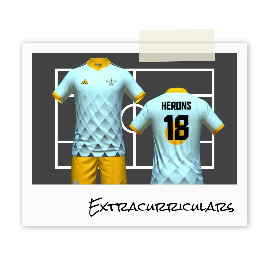
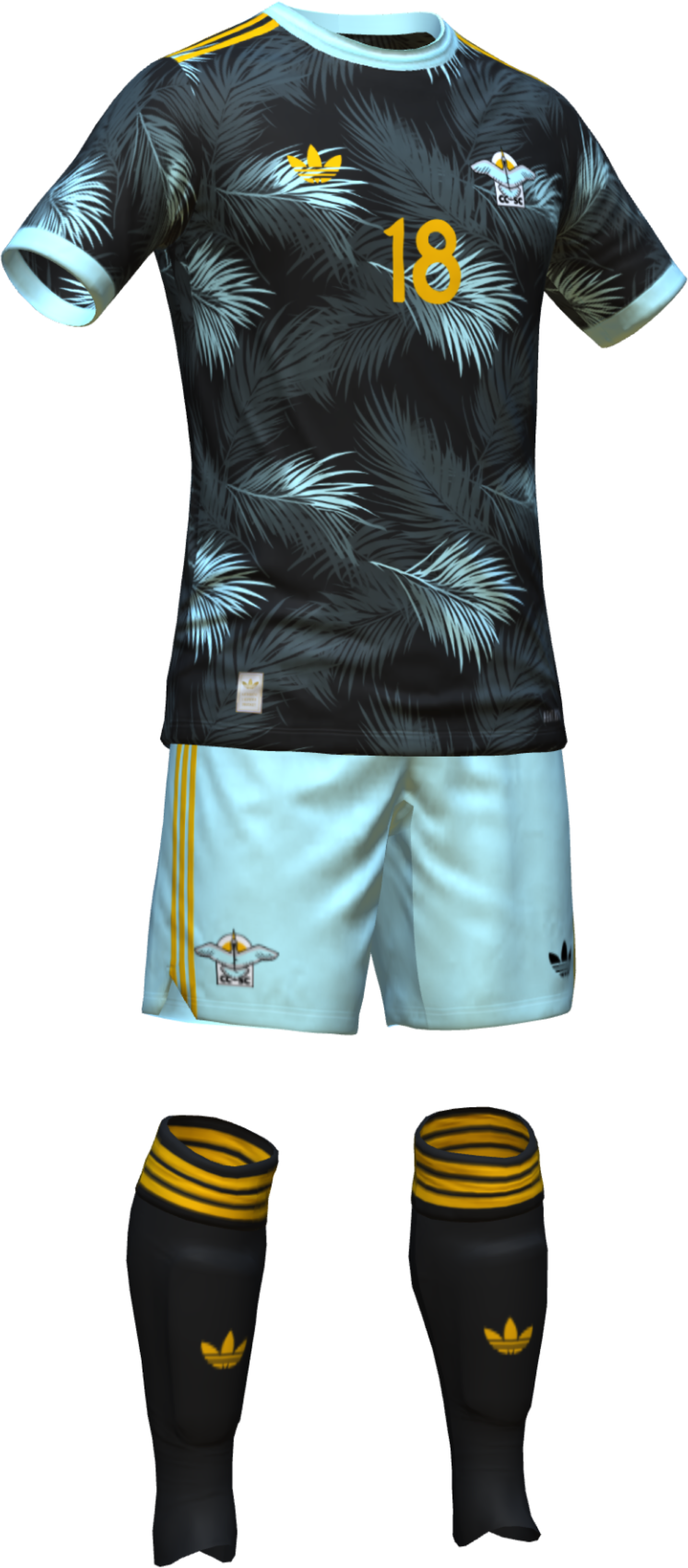
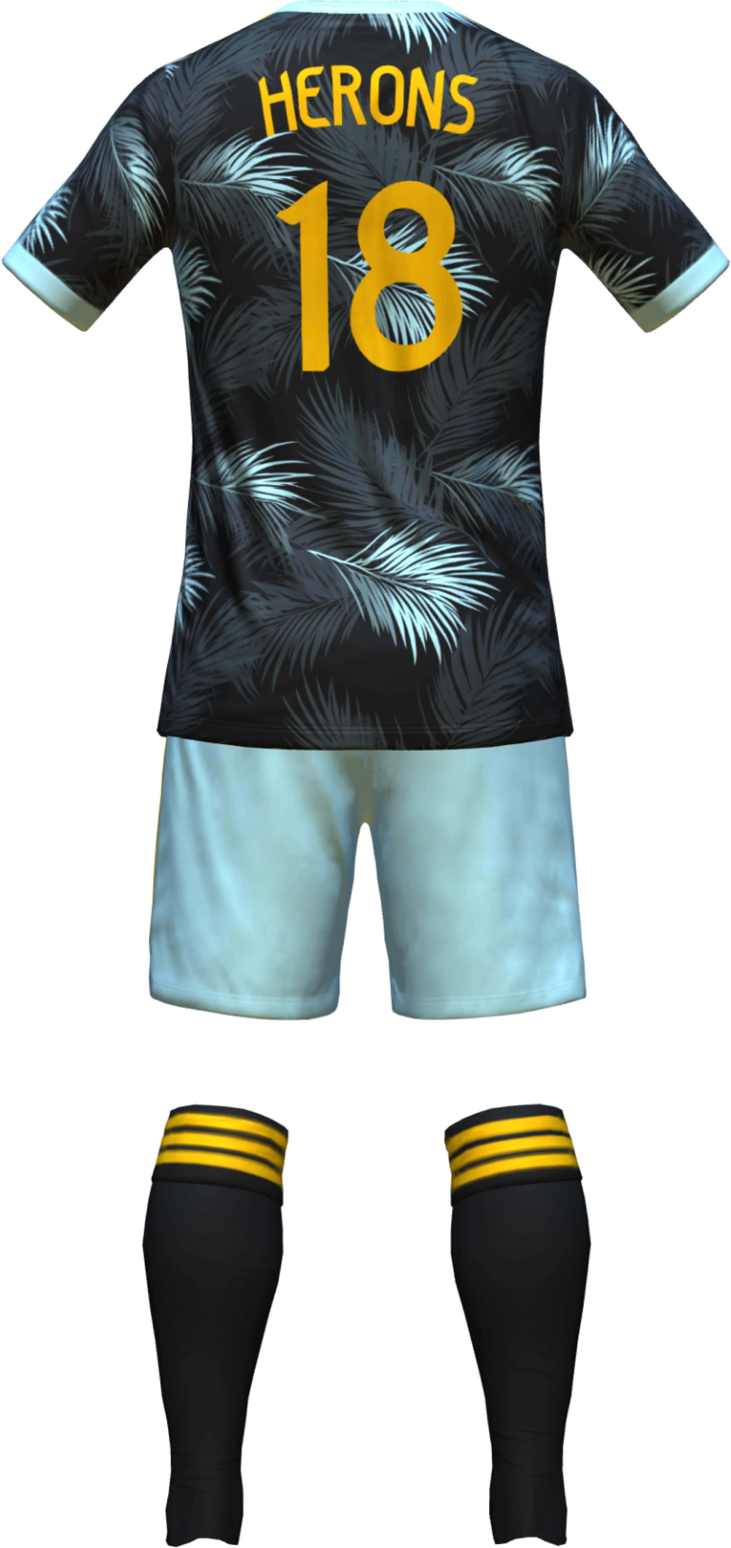
2025 Kits
Primary Kit


Secondary Kit
Third Kit

